
Connecting houseless individuals with low-cost healthcare

CareLink
ROLE
Product Development Director
SKILLS
Visual Design
Prototyping
Frontend Development
Backend Development
TIMELINE
10 weeks+ (Ongoing)
BACKGROUND
Accessing healthcare is a major challenge for houseless individuals, who often struggle to find accurate, up-to-date information on low-cost health services. Many existing directories are outdated or difficult to navigate. Project Lux, a student-led organization with chapters in universities across California, is working to bridge this gap by compiling a repository of low-cost healthcare resources that offer services ranging from dental care to health insurance navigation. However, it is managed through a shared internal spreadsheet, limiting its accessibility and ease of updates.
UNDERSTANDING THE PROBLEM AND THE USER
First, to better understand how existing solutions functioned, I conducted a competitor analysis of similar tools, like Kaiser Permanente's resource directory and the Health Resources and Services Administration's Find a Health Center tool. I noticed several common patterns, and identified gaps and opportunities for improvement.
Common features
Multiple input types (city, zip code, address)
Search radius customization
Category filters
Map-based results view
Areas for improvement
Lack of real-time updates from organizations, leading to information that may be outdated
No offline-friendly methods for those without stable internet
Limited multilingual support for non-English speakers
Next, to identify problems specific to the organization, I conducted user interviews with Project Lux members who were involved with managing and updating their current local resource database. Through these interviews, I gathered several valuable insights that would help me develop a solution that was aligned with their workflow, easy to implement, and genuinely useful for both houseless individuals and organization members.
Centralized dashboard
Participants desire a centralized admin dashboard where members can access, add, and edit resources, as well as view relevant search analytics
Increasing accessibility
Participants suggested several features for improving accessibility, such as offline access, filtering results, FAQs, and support for multiple languages
Core mission
Participants mentioned that their primary form of service is still providing
in-person assistance at various shelters and clinics, and this tool is meant
to be secondary solution to their mission of increasing equity in healthcare
To ensure the solution addressed the unique needs of both those seeking resources and those managing them, I translated these insights into two user personas (one for each group of users), which would be referenced throughout the rest of the design process to maintain a user-centered approach.


DEFINING THE SOLUTION
Using the insights gathered from the competitor analysis and user interviews, I moved onto defining core project goals that would guide the design of the solution.
Business Goals
Enhance the Project Lux’s ability to bridge the gap between low-cost healthcare and houseless individuals by providing a scalable, efficient resource tool
Reduce the time and effort that organization members spend on manually updating and sharing resource information
Foster trust and stronger relationships between the organization, its partners, and the houseless community
User Goals
Easily find nearby clinics, shelters, and other healthcare resources that meet their needs
Filter resources based on specific requirements, like walk-in availability or language services
Access accurate, up-to-date information without requiring consistent internet connectivity
Technical Considerations
Database with resources that can be easily indexed across multiple fields (e.g. location, category)
Maintaining mobile usability while maintaining full functionality on desktop
Real-time admin panel for keeping resource listings accurate and up to date
With clear project goals in place, the next step was to define how users would interact with the platform to meet their needs. I mapped out two user flows, one for each side of the solution, so that both types of users would be able to seamlessly navigate the platform. These flows guided the structure of the platform and helped prioritize key features when designing.

WIREFRAMES / MOCKUPS
Building on the defined user flows, I translated key interactions into low-fidelity digital wireframes to establish the platform’s structure and layout. Due to the timeframe of the project and its limited scope, I rapidly iterated on these wireframes and then moved onto refinining them in high-fidelity.
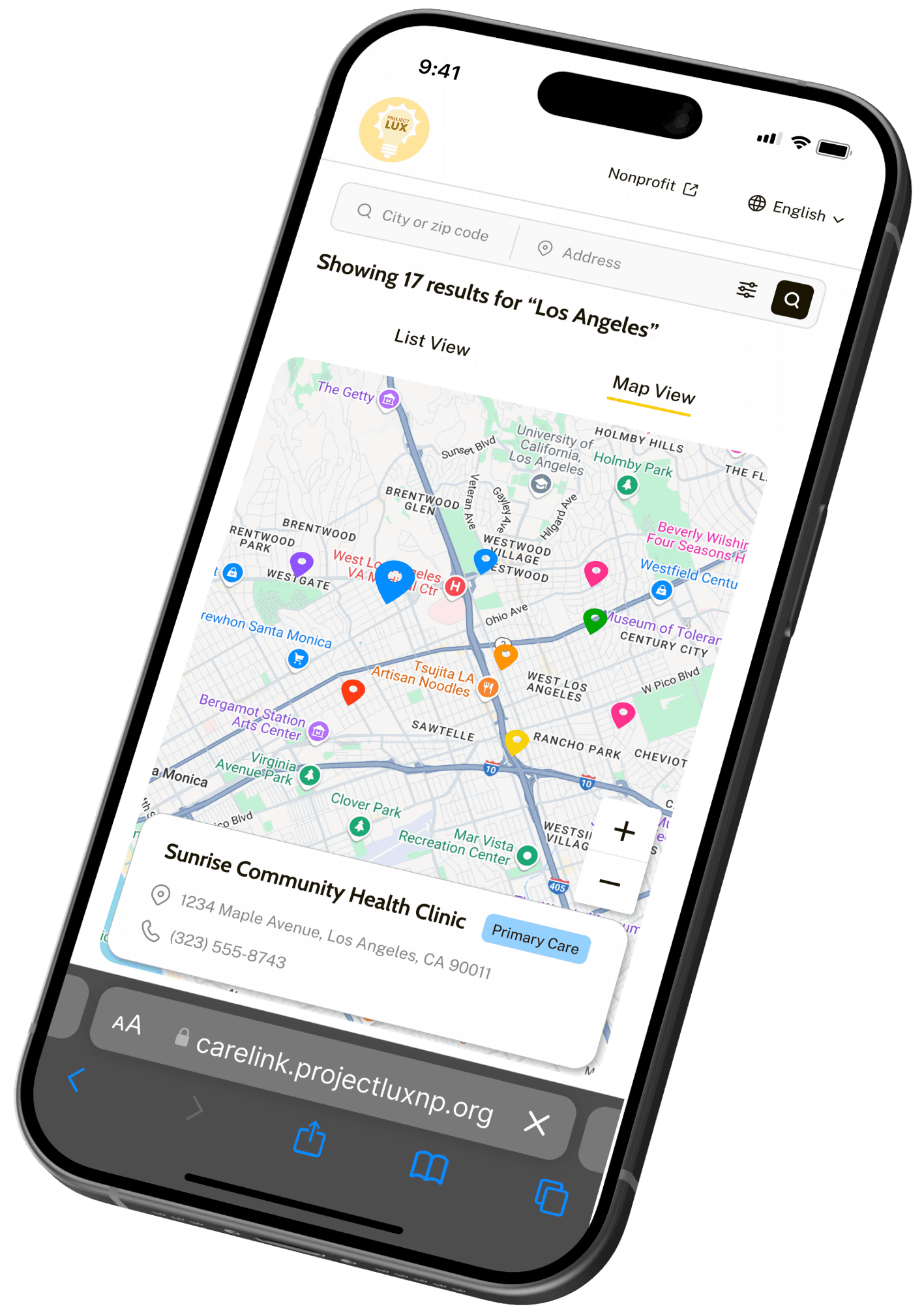
Search Tool


Admin Panel


To make the search tool accessible across different devices, I designed both desktop and mobile layouts, ensuring a smooth and intuitive experience regardless of screen size. The desktop version prioritizes a more spacious layout for viewing multiple resources at once, while the mobile design streamlines navigation for on-the-go access. Key elements, such as the search bar and filters, were adapted to remain functional and easy to use across varying screen sizes, maintaining consistency in both visual design and usability.
Search Tool


Admin Panel


TESTING / ITERATIONS
After finalizing the visual design and interactions, I moved on to usability testing to assess how effectively the platform addressed user needs. I conducted virtual moderated tests with five participants, focusing on the completion of the two defined user flows, which yielded valuable insights into navigation, clarity, and overall usability. Using this feedback, I made refinements to improve accessibility and enhance the user experience.

old

1
2
new
1
Increased font sizes to improve readability
2
Redesigned search bar and added a filter for resource type

old

3
new
3
Increased font sizes to improve readability
DEVELOPMENT / NEXT STEPS
After designing the high-fidelity mockups for the key screens, I jumped straight into developing the website. I skipped making a prototype due to the relatively simple structure of the site, and the need to push out a functional product as soon as possible. I began with building the frontend using React, substituting in some dummy data for testing. Then, I set up a MongoDB cluster to store all the resource data because of its flexible schemas and and simple querying language (I anticipated needing to add fields for certain resources, like languages spoken, insurance policy, etc.). Finally, I built API routes using Express.js and set up a backend server to allow the frontend to fetch resources from the database, and wrote a script to import the CSV file containing the resource data into the database. As of April 2025, the website has been fully deployed and is live at https://carelink.projectluxnp.org.

Frontend

Middleware + Backend

+

Database
As the platform moves forward, there are key improvements planned on the development side. The first priority is to create an admin panel to allow Project Lux members to add and edit resource information without having to write code or go into the database itself. Multi-language support will be also added to cater to a wider audience, addressing language barriers and ensuring the tool is accessible to both English and Spanish-speaking users. Additionally, offline access or the ability to download resource lists will be integrated, enabling houseless individuals to access information about resources even without reliable internet connectivity.