


Reimagining food discovery with community feeds


ROLE
UX Researcher
Visual Designer
SKILLS
User Research
Prototyping
User Testing
TIMELINE
5 weeks
BACKGROUND
Beli is a restaurant discovery app that helps users track, rate, and share their dining experiences. While users appreciate Beli’s personalized recommendations, many feel limited by its current social features, which primarily focus on their immediate network. Many users turn to other platforms for broader insights, seeking a balance between trusted recommendations and community-driven discovery. Additionally, sharing restaurant finds on Beli is limited, with users relying on external apps to find curated guides helping them find their new favorite spots.
UNPACKING THE CURRENT USER EXPERIENCE
Before diving into user research, I started off with a competitor analysis to compare Beli with similar platforms on the market and understand how they facilitate restaurant discovery and social engagement. This helped with identifying what works well and where Beli and other competitors may fall short, providing a strong starting point for defining the problem space.

While a competitor analysis helped me identify industry trends and gaps in existing restaurant discovery apps, it didn’t fully explain why users engage with these platforms. To bridge this gap, I conducted interviews with current Beli users to understand:
Primary motivations for using Beli
How users currently discover restaurants through Beli or other platforms
Barriers making it difficult to consistently engage with content on Beli
General interest in seeing broader social content on Beli
After organizing and analyzing the insights I gathered through an affinity map, I came away with the following key themes:
Discovery happens elsewhere
Users prefer more traditional social media apps to discover new restaurants, due to the more engaging content format and larger user base, and usually only open Beli to log or bookmark a restaurant.
More than just reviews
Users feel that adding more forms of content would make the app more engaging and useful.
A blessing and a curse
Beli’s community feels "intimate" but "limited. It’s nice to have a small community of friends who are passionate about food, but at times it feels too private.
Craving diverse opinions
Seeing a wider variety of opinions and reviews from users outside their network would be valuable in deciding on whether to try a new restaurant.
FRAMING THE PROBLEM
To make sure my designs were grounded in real user needs, I created two user personas based on the insights I gathered from the previous research. These personas helped me illustrate user motivations, needs, and pain points — particularly their desire for both trusted recommendations and broader community content.


Now that I had a clear understanding of user needs, I moved on to defining the problem by crafting problem statements and reframing them as corresponding How Might We questions. This step helped further distill the key challenges I discovered into focused, actionable opportunities for design.
How might we create a balance between personalized recommendations and broader community input so users feel confident in exploring new dining options within Beli?
How might we design more comprehensive discovery features within Beli, making it a platform that allows users to share, discover, and log their dining experiences in one place, therefore reducing their need to rely on multiple platforms?
EXPLORING NEW FEATURES
With clearly defined problem statements, I now needed to determine the best way to address these challenges. I prioritized solutions based on impact, feasibility, and how well they enhanced the overall user experience. This process helped me narrow down the most two valuable features to move forward with: a community feed and user-curated lists.
#1. Community Feed
A separate feed section for user reviews and ratings beyond friends' networks, allowing users to view top-rated/trending places and popular reviews within their city or neighborhood
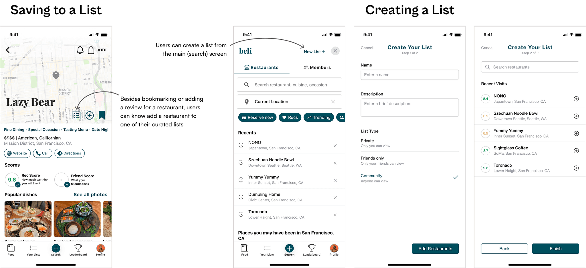
#2. User-Curated Lists
Users can curate and share lists of restaurants that can be explored by the community. Lists can be public, private, or friends-only, depending on user preference.
Next, I moved into the early design phase by creating low-fidelity wireframes of the new community feed and user-curated lists, focusing on layout and functionality.
Community Feed

User-Curated Lists (Creation)

FROM CONCEPT TO DESIGN
Before jumping straight into converting my low-fidelity wireframes into high-fidelity mockups, I started with creating a UI kit based on the current app to maintain consistency.

Now that I had the UI kit established, I designed high-fidelity mockups incorporating the defined colors, typography, icons, and components into the low-fidelity wireframes, bringing the features to life.

TESTING / ITERATIONS
In order to assess how well users could navigate the new community feed and create curated lists, I conducted a series of virtual usability tests centered around those two features. By observing real interactions and gathering feedback, I identified areas for improvement and made refinements to enhance clarity, engagement, and overall usability.

old

1
2
3
new
1
Added options to sort the community feed by taste match, rating, and distance and change the location, making discovery easier
2
Taste match score for each post, representing the amount of overlap between the current user and the user who made the post.
3
Added a rating score to lists (average score of each restaurant in the list)

old

1
new
1
Moved “add to list” button to the same row as the “website”, “call”, and “directions” buttons to reduce visual clutter

old

1
new
1
Extended restaurants in the recent visits section so users can scroll and view all restaurants they have visited
With the iterations added, I linked up all the screens and created the final prototype:
REFLECTIONS
Given that I was adding a feature to an already existing product, this project came with a unique set of challenges which also revealed hidden opportunities. For example, I initially felt constrained by the existing features of Beli, but this meant I could deeply analyze each feature to figure out areas for improvement so that the new features I introduced would not only complement the current features but enhance the overall app experience. Also, I had to adhere to the existing design system, but this allowed me to focus more on refining smaller details to further enhance the usability and clarity of the new features. Overall, this project helped me become better at understanding and empathizing with the user, as well as solving problems despite design constraints.